Day 2
1:30-2:45pm
Converting Visitors Into Buyers – I think this was my favorite session so far. The panel focused on what to do with your traffic when you get them to your website, and why so many businesses have ignored this side of the coin. (literally, think COIN) If you spend millions getting people to your homepage, shouldn’t you spend millions making sure they stay there too? Many people would rather pay for more traffic than address the problem existing traffic has with their website, and that loses sales.
2 Speakers:
Nigel Ravenhill, Scanalert
Bryan Eisenberg, Future Now
Nigel started the afternoon with reference to Heidi Cohen of Clickz.com recent article about website visitors taking longer and longer to make a purchase, even in the fast world of the Internet. Its no suprise that the more competitive the product, the longer searchers wait to buy…they want to find the best deal and are researching accordingly.
Statistically speaking, from 2005 to 2007, reported conversion rates boosted from 2.5% to a whopping 3%….. whippty do. That doesn’t say much for us webmasters out there, or the website owners. So, what are the reasons conversion rates are still so low? The main one is actually security, if you put a no spam and no hacking button on your cart you will probably increase conversions immediately. What else? Make yourself appear real: physical location, contact info, hours of operation. People are still afraid you can disappear into the Internet abyss with their money, so you need to make them comfortable.
There are a few other factors to really look at when converting your visitors. For example, was the SITE abandoned or the CART abandoned? If its the cart, the visitor could have simply decided on a different product. If its the site, what didn’t you tell them to make them comfortable??? But if its the site in the middle of the day, what if its The Boss telling them to get back to work??? How can you find out? One way is keeping good cookies, see if they come back; even weeks later. Their money is still green then too, right? Don’t you want to know how long your average conversion takes?
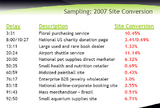 Here are a few more things Nigel suggested:
1. Answer and Anticipate Questions – have FAQ’s, toll free numbers, live chats, and physical addresses that link to maps.
2. Help people share info – bookmarks, email to a friend links, IM and social networking bookmarks
3. Enhance the experience – buy now, save cart, wish list, news and rss registration
He went further to point out a case scenario where a company simply emailed people who abandoned a shopping cart with products in it. The results? 246% conversion. One automated email, millions of dollars. Go ahead and try to follow up with abandoned users, even if its only a survey to find out how you can keep them next time. LISTEN to your users and they will be willing to give you their trust and money.
Next up was Bryan Eisenberg; LOVED HIM!!!! He’s my favorite speaker so far. I also enjoyed his Call To Action book, I read it after our last SES seminar. Since I aspire to become a speaker in this industry one day, I have to give him props for totally standing out and having innovative, easy to apply ideas. I really can’t say enough good things about how inspiring his research and works are. Plus he’s got ca-ca-charisma 🙂
Bryan posed the question “Why are 95% of your visitors abandoning you, on a good day?” There are 7 formulas to online success. People don’t buy from trust, or priority; they buy from MOTIVATION. He encouraged us to stop looking at and calling our website visitors “users“, it has a negative connocation. Think of them as friends or visitors. That’s better. Now if I say “friends” in the rest of my blog posts… I am talking about your web visitors, ok? 🙂
Bryan compared site analysis to a crime scene, we have to be smart detectives to figured out what happened with the clues that were left for us. This will be a metaphor I use for our clients in the future, Bryan, it makes it easy to put into perspective.
Here’s a crappy drawing of his conversion pyramid:
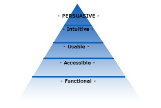
Your lowest level is functionality, ask “does it do what I need?”. Then consider if the website’s accessible, aka with SEO. Ask: “can everyone access it?”. Moving up the ladder, you have usability, ask “is it user friendly?”. If you’re intuitive and anticipate your friends’ 🙂 questions, then you will make more friends. Your website should feel right and have a natural flow. But HOW do you be persausive? That’s the sweet spot for online sales. You can’t be a pushy salesman…people sniff that out from a mile away. How do you appeal to people?
Get to know your visitors. Make them your friends. How? Bryan talked about the 4 main personality types, and how they all need to see and hear something different:
1. Competitive
2. Spontaneous
3. Methodical
4. Humanistics
He discussed a case study with Overstock’s DVD website, and how they hired him to sell more DVD’s. Even when buying a DVD, the personality shows through. Spontaneous people look for top sellers and new releases, humanistics care about ratings and reviews, methodicals search by genre, and competitive search by actor and title. I didn’t think I was competitive, but I would probably search that way…interesting.
Whatever your site is, define your 4 personalities of friends. Chris Competitive, Suzi Spontaneous, Mary Methodical, and Harry Humanistic. Ask your visitors what they want to see and know! Ask on every site:
WHO are we trying to persuade to take action?
WHAT action do we want them to take? (make it measureable with your analytics)
WHAT info do they want (use test pages, surveys, email follow up. find out what your visitors need in order to be comfortable with your purchase)
Here’s a case in point, subject: ME. Mike’s birthday is Wednesday and I wanted to order him a candy basket. (Since I am a bad wife and out of town). Sorry hun, serious 🙁 I absolutely positively NEED that damn basket delivered on Aug 22nd (I was ordering Monday night) and I abandoned 4 different websites because my shipping options were “ground – 2 to 3 days”, “rush – overnight”, etc.
Sliding scales are fine when I’m ordering a candy basket for a client as a thank you, get it there whenever. I needed the basket to arrive on Aug22, not the day before or after. The site which allowed me (on page 1) to choose by DATE the delivery, was the site who got my credit card info. THINK about what your users want and need, and it varies by scenario just like me.
If you have to use a system like Bizarrvoice for feedback, go right ahead!
There are 7 keys to remember when trying to write persausive pages:
……drumroll please…..
1. Use product images that tell a story. Make your images confirm your headlines.
2. Test headlines and hyperlinks. Are they for you or your user? Are you we-weeing all over yourself? Try something like “New to —
3. Improve calls-to-action. Bigger buttons can mean millions of dollars. Test drop shadows, outlines, highlighted, shadowed, crossed out prices, stand out colors…everything.
4. Improve point of action assurances. For example, if you’re buying clothes, you probably want to see information about no hassle return policies, secure shopping, customer reviews, and shipping times.
5. Make your intention obvious and expected
6. Test “contact me” or “submit” or various different button names. What your buttons say makes a difference, it can mean millions of dollars.
7. Make SURE you are providing a relevant scent. People need assurances on the page in the headlines, title, text, etc. They will leave if they’re “not sure” if they are in the right spot. Another site will tell them for sure, so yours better too.
To wrap up, Bryan stressed the importance of not only driving plenty of traffic to your website, but also FOCUSING on aquisitions.
Random fun tips from Bryan: Hate phone trees? If you want to get to a human right away, here’s how you do it with the big companies: http://gethuman.com/ in ABC order right for the user….niiice.
Even with all our technology conversion rates have not increased more than .5% in the last THREE years. boooooo.

